Case Study: Redesigning Celine.com for a Luxury Boutique Experience
Problem Statement
Celine is a renowned luxury fashion house, yet its website feels more like a functional catalogue than a high-end boutique experience. Unlike competitors such as Gucci, Dior, and Yves Saint Laurent, (YSL) Celine’s site prioritizes efficiency over immersive storytelling, missing the subtle refinements that define luxury UX. This case study explores how to transform Celine’s digital presence by enhancing brand perception, improving navigation, and aligning product presentation with the elevated standards of luxury e-commerce.
1. Introduction
A. Context
Celine is a renowned luxury fashion house, yet its website design aligns more closely with multi-brand catalogues like SSENSE rather than the immersive, high-end boutique experiences seen in competitors such as Gucci, Dior, and YSL.
B. Redesign Goal
The objective of this project was to shift Celine’s digital shopping experience from a functional catalogue to a luxury boutique, emphasizing brand storytelling, refined UI, and high-end interactions.
C. Key Focus Areas
- Homepage - Enhance brand presence and editorial storytelling.
- Product Listing Page (PLP) - Create a more spacious, curated browsing experience.
- Product Detail Page (PDP) - Improve product storytelling and shopping flow.
- Navigation & Menu - Streamline structure and align with boutique UX standards
2. Competitive Analysis & Key Findings
A. Analysis of Luxury E-Commerce Trends
A comparison of Celine.com with both luxury boutiques (Gucci, Dior, YSL) and multi-brand catalogues (SSENSE) highlighted key UX differences:
Navigation
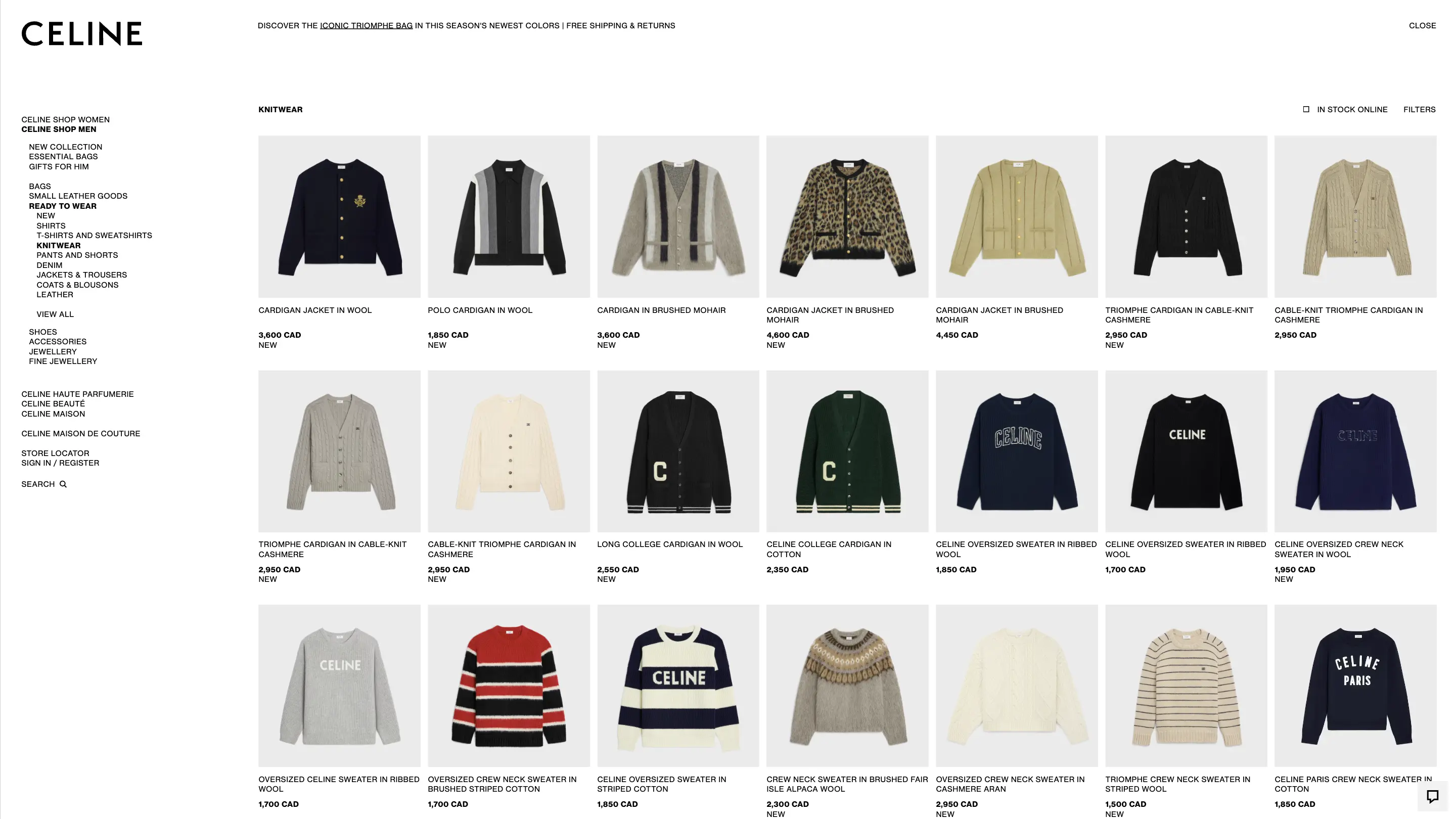
Static sidebar menu
Functional top nav
Progressive disclosure, minimal menu
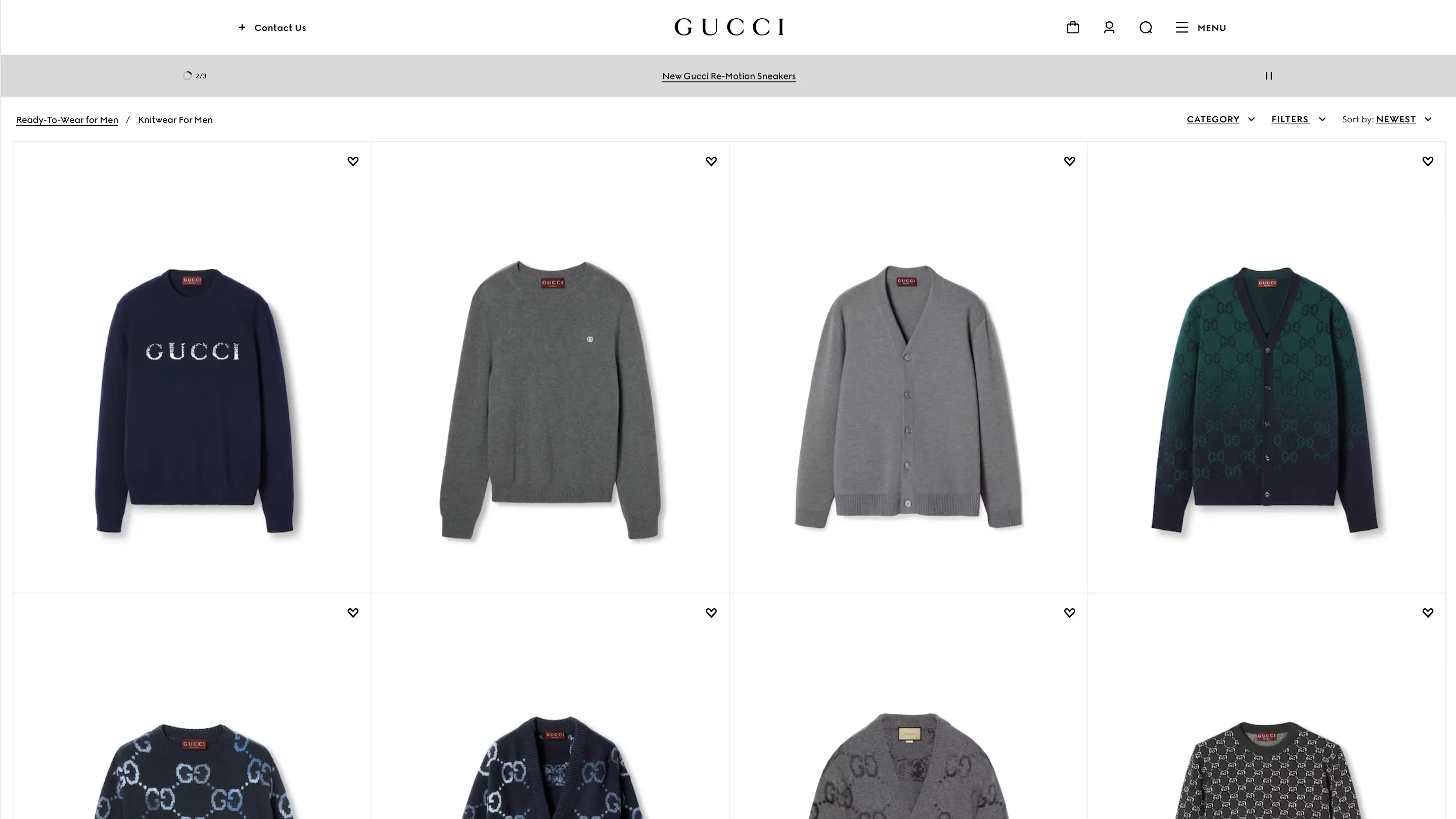
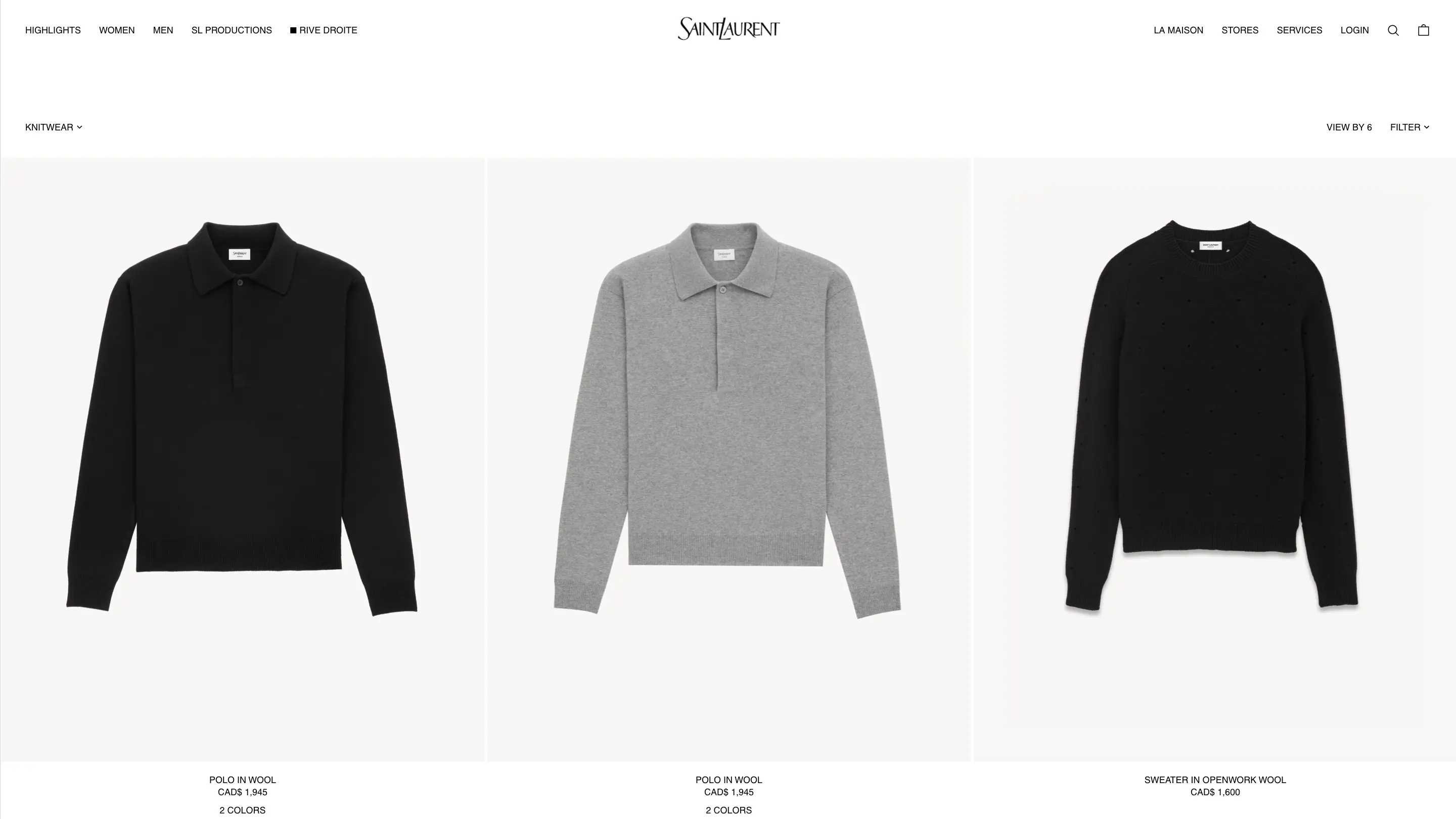
Product Listing Page (PLP)
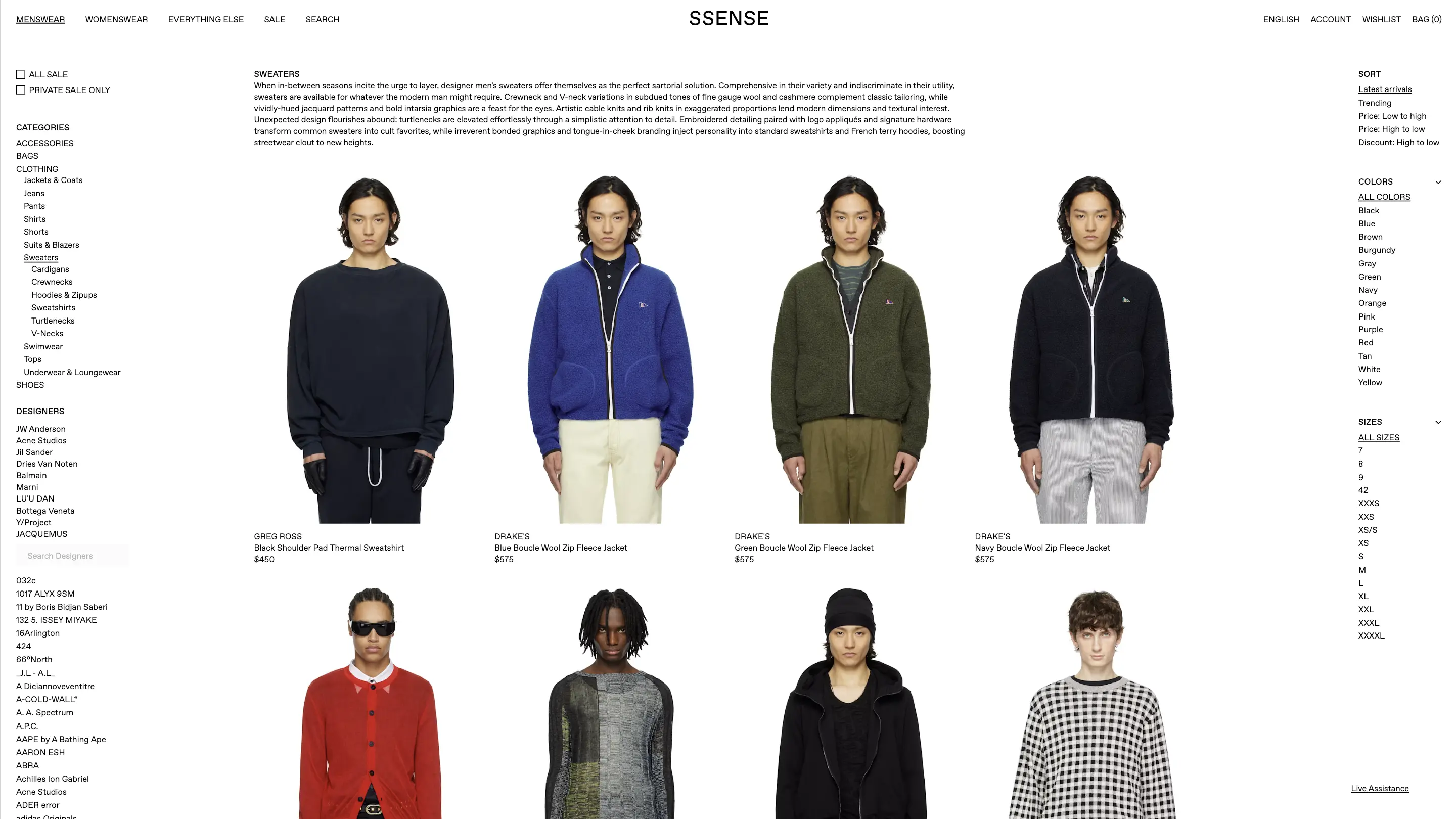
4-7 Items per row
Dense product listing
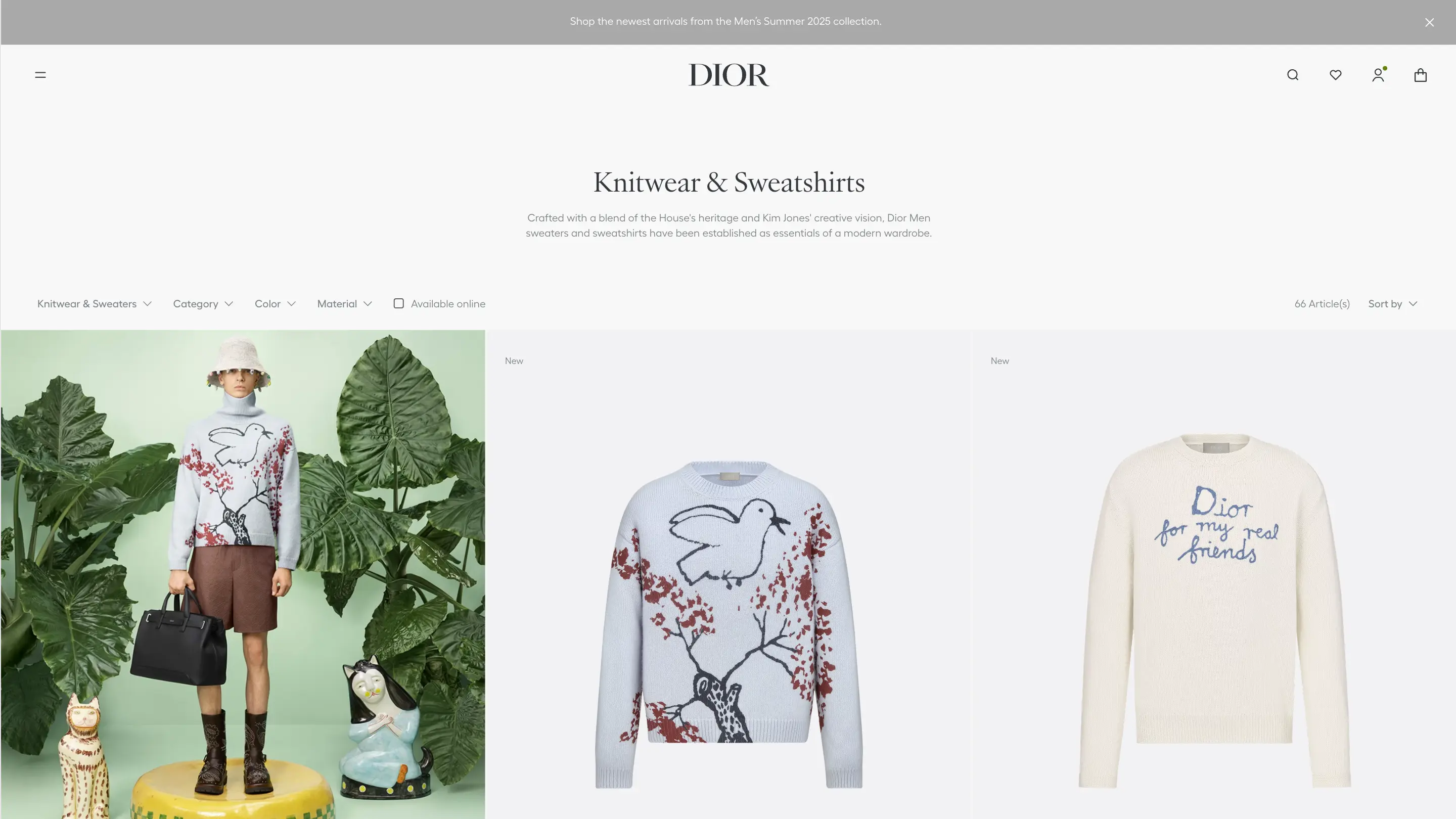
3-4 items per row, editorial-style
Product Detail Page (PDP)
Simple hover effects
Functional layout
Immersive storytelling, motion effects
Brand Presence
Minimal storytelling
Focused on usability
Strong brand visuals & narrative
Scroll horizontally to view the whole table
B. Comparison of Celine’s Current Site vs. Competitors.
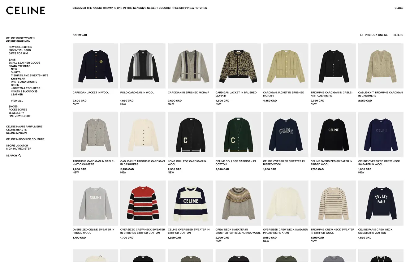
For example, observe how Celine’s Product Listing Page displays 4-7 items per row, similar to the dense product listing of a catalogue like SSENSE; whereas luxury boutiques only display 3-4 items per row.
C. Key UX Findings
- Celine’s dense product grid lacks the refined spaciousness expected in luxury e-commerce.
- Sidebar navigation feels more functional than premium.
- Minimal storytelling reduces emotional engagement with the brand.
- Static elements miss the immersive interactions and animations seen in competitors.
D. Heuristic Analysis
Boutiques
Large hero image
UX Heuristic
Aesthetic and Minimalist Design
Explanation
A single large hero image aligns with luxury branding by emphasizing high-quality photography. However, multiple images (like SSENSE) may allow for more dynamic storytelling.
3. Iterative Process & Mid-Project Adjustment
A. Updating the goals of the Redesign
- Create an immersive brand experience - Stronger storytelling, premium interactions, and high-end UI.
- Align UI with boutique UX standards - Luxury-focused layouts, hover effects, refined typography.
- Enhance shopping behaviours - More intentional CTAs, progressive disclosure, and motion enhancements.
B. Discovering the Chat Feature Gap
Online luxury boutiques often integrate concierge-style chat features, offering clients an individualized boutique-like shopping service and reinforcing exclusivity. These are implemented with buttons and branded icons on the bottom-right corner of their pages.
Other boutiques' chat features
This lead me to create for Celine's site:
- A floating chat button in the bottom-right corner.
- Branded, minimalist styling to maintain visual harmony.
My newly designed Celine chat button, featuring the ‘C’ from the ‘CELINE’ logo, for consistent branding
C. Refreshing the menu
As a reflection of the savoir faire that crafts luxury fashion, luxury UX is a culmination of small, almost imperceptible details. For example, micro-interactions when a user hovers over a menu item reinforce the attention to detail that is present across the entire luxury experience. In addition, a soft background (present throughout redesigned site) subtly enhances the premium feel—elevating the overall experience without calling attention to itself.
The old hover effect, featuring a subtle bolding
My newly designed hover micro-interaction, featuring a dynamic underline effect
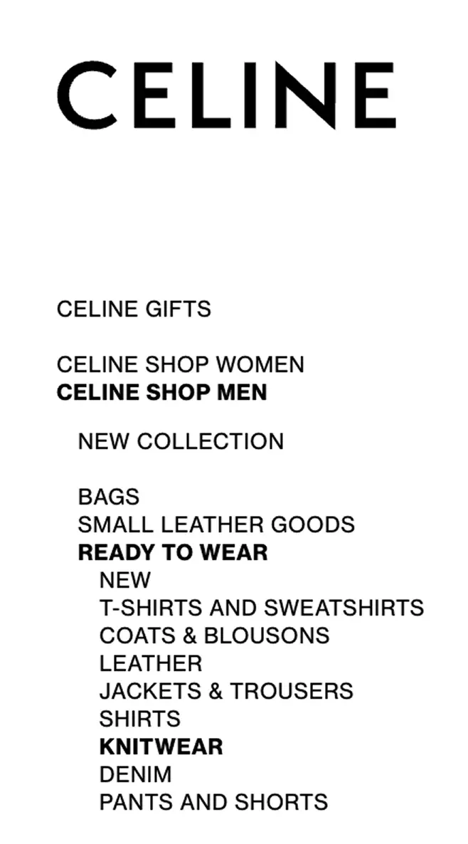
Another gap in the current Celine site involves an inconsistency of using both ampersands (“&”) and the word “and” in the menu. To maintain the consistency seen in other luxury UX sites, I standardized the menu to use an ampersand instead of “and” across all categories.
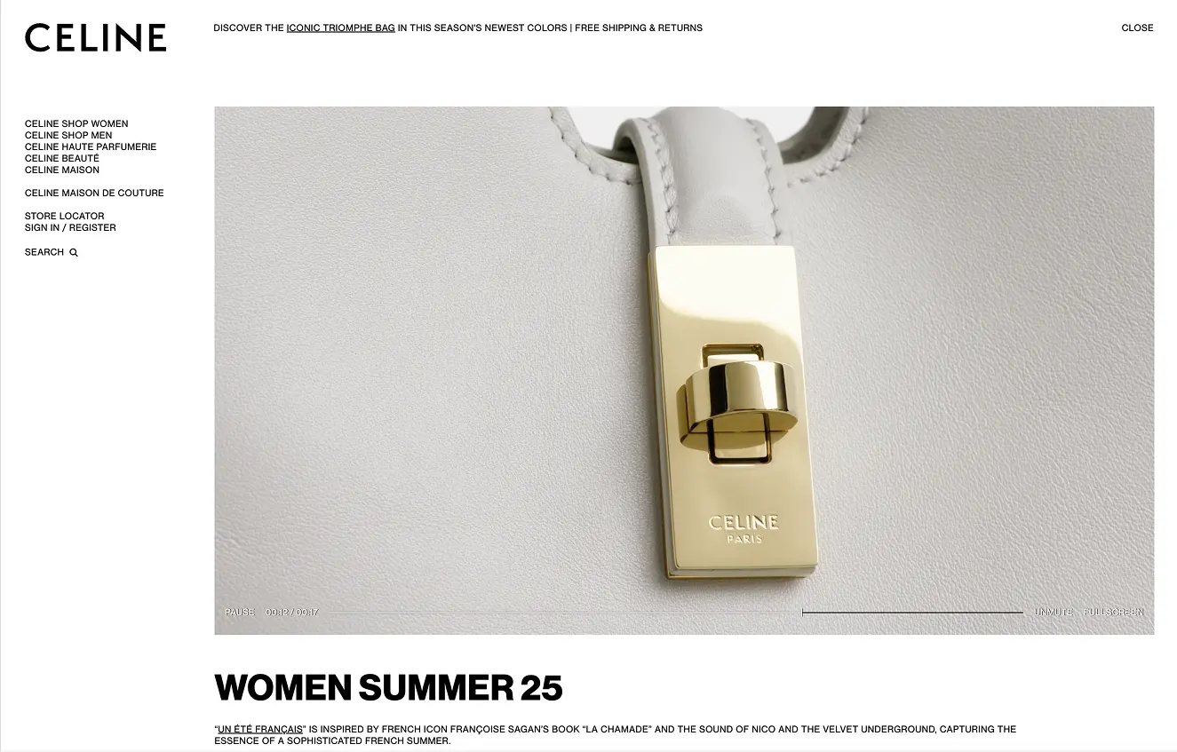
Celine’s current sidebar navigation menu, featuring both ampersands and the word “and”.
D. Refining Product Descriptions for Luxury Appeal
During the mid-project refinement, I identified an opportunity to enhance the individual product pages by elevating their descriptions. Drawing inspiration from luxury leaders like Dior, I transitioned from functional descriptions to evocative storytelling that aligns with Celine’s brand ethos.
By incorporating rich material details, historical references, and aspirational language, the product pages now better reflect the exclusivity and refinement expected in luxury e-commerce.
This change further supports the overarching goal of the redesign—transforming Celine’s website from a functional catalogue to a high-end boutique experience.
4. Development Process
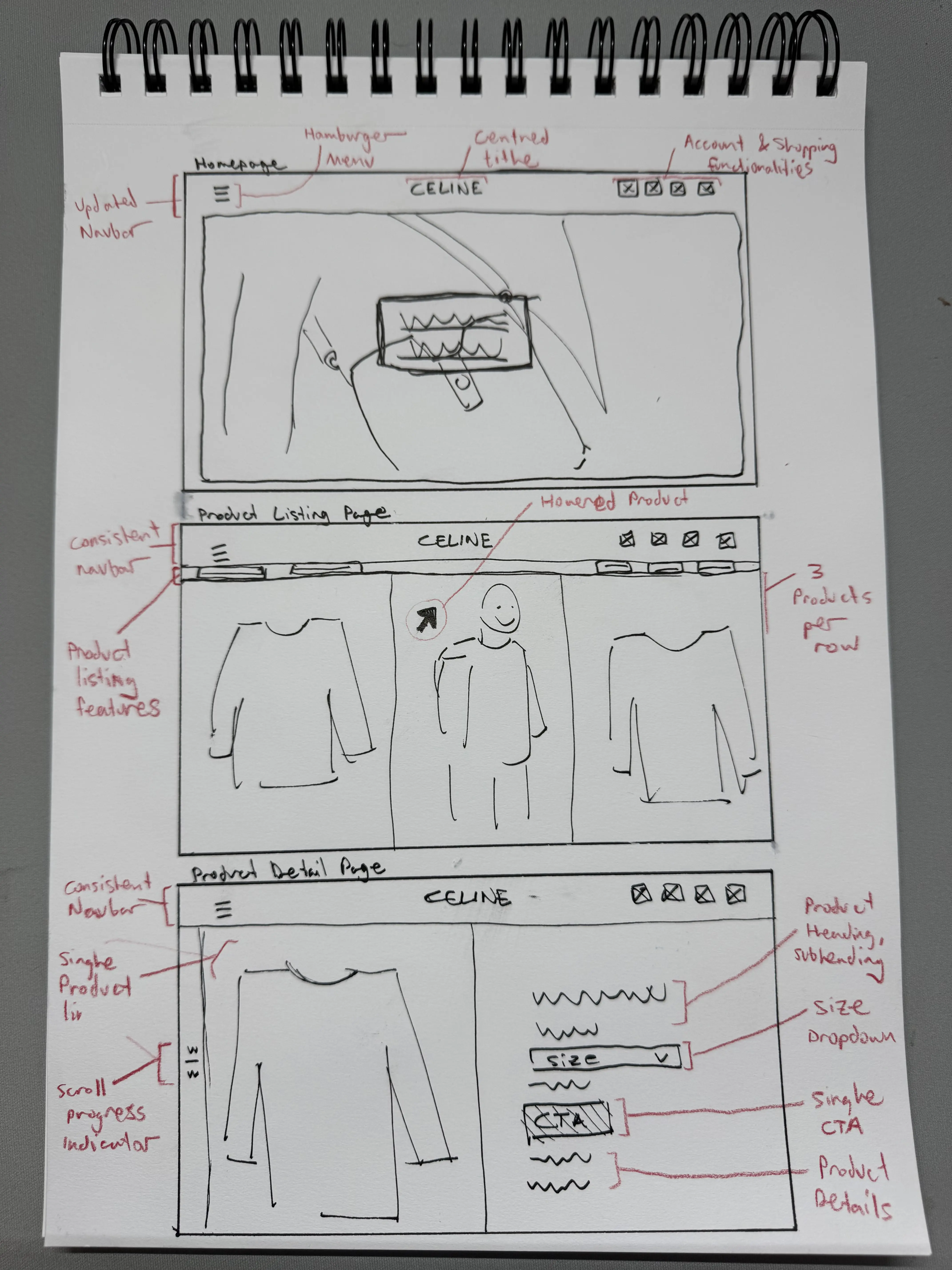
A. Wireframe Sketches
A series of quick hand-drawn sketches mapping out the homepage, product listing page, and product detail page. These focused on layout, navigation patterns, and supporting user goals with a clear hierarchy.
B. Digital Wireframes
Clean digital grayscale wireframes were created to refine spacing, alignment, and visual flow. The goal was to balance luxury aesthetics with clarity and functionality.
C. Stylesheet
To align the visual direction with the refined elegance of luxury fashion, I developed a minimalist style guide that emphasized restraint and clarity. The typography was chosen to feel timeless yet contemporary, while the neutral color palette created a sense of quiet sophistication that allowed product imagery to shine. Grids and spacing were carefully considered to maintain balance and structure, creating a clean, editorial feel across all screens.
5. Final Prototypes & Impact
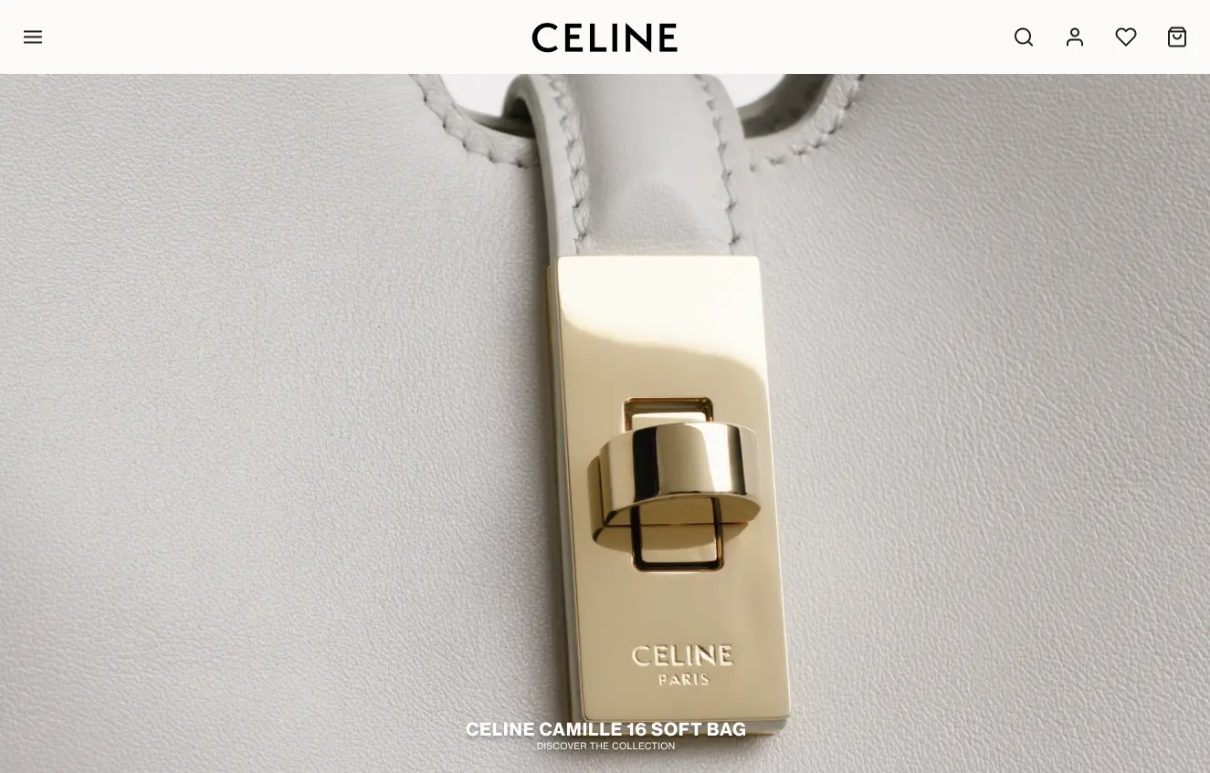
My redesigned Homepage, featuring the top navbar and centred title
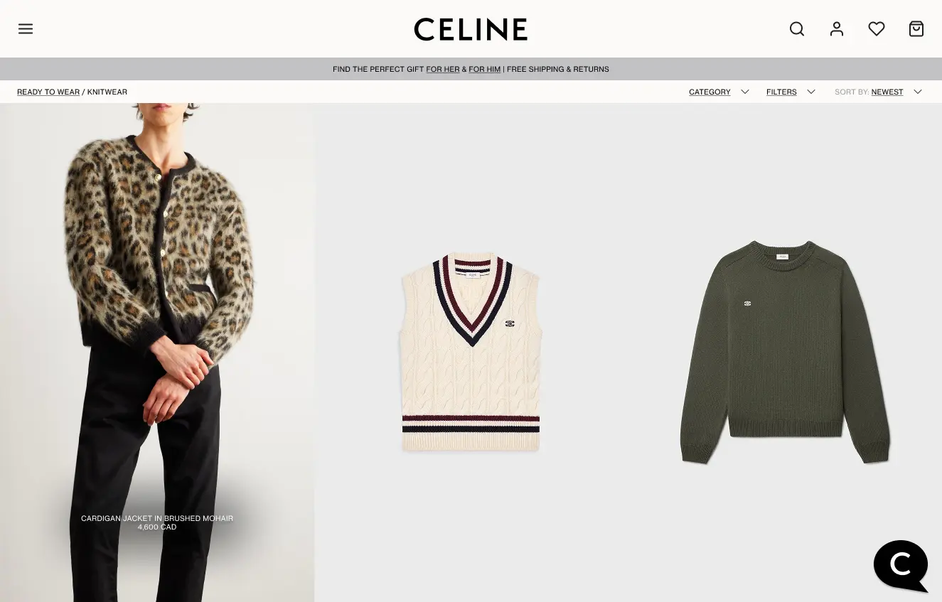
My redesigned Product Listing Page, demonstrating the updated hover effect on the first product
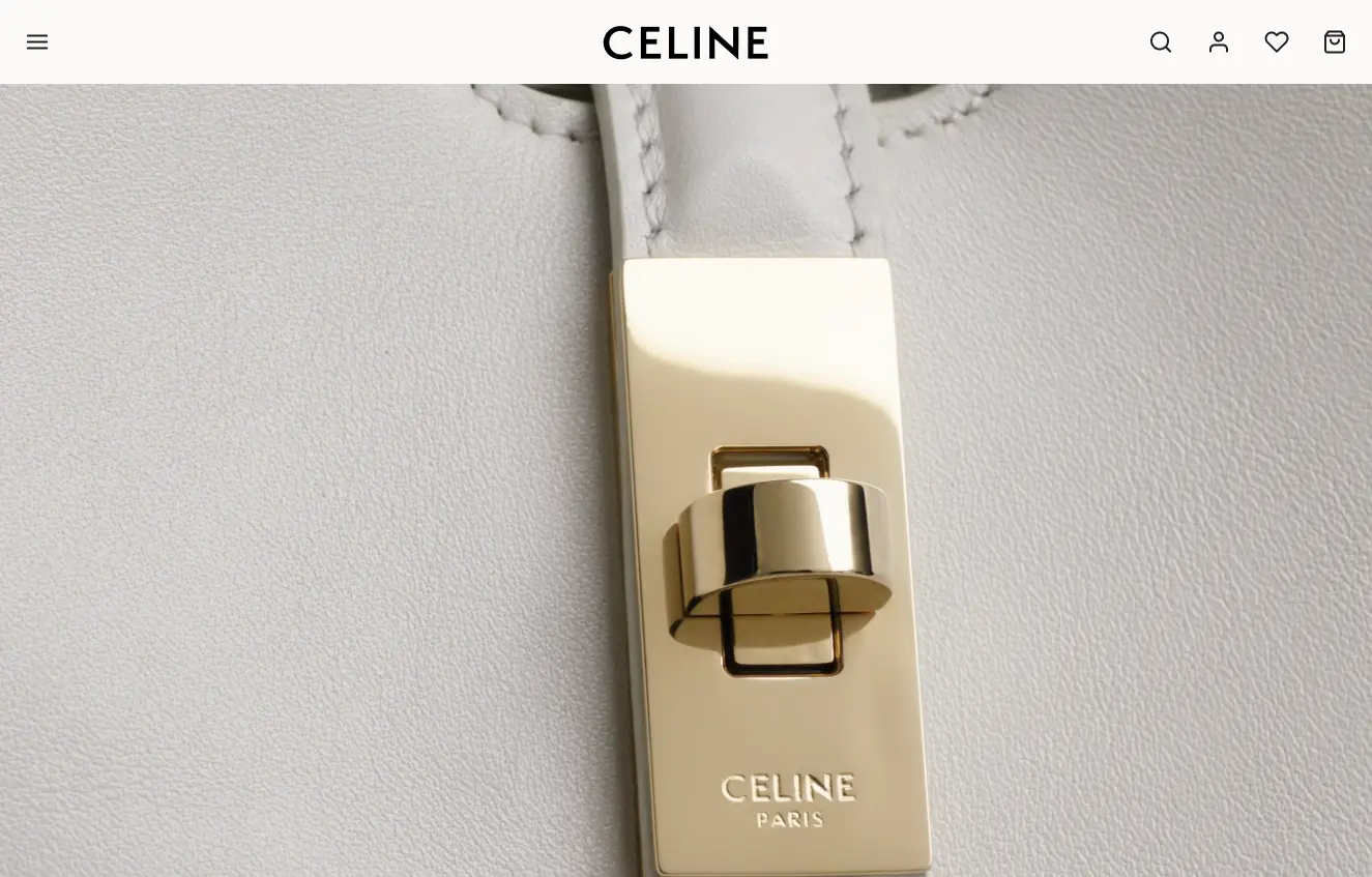
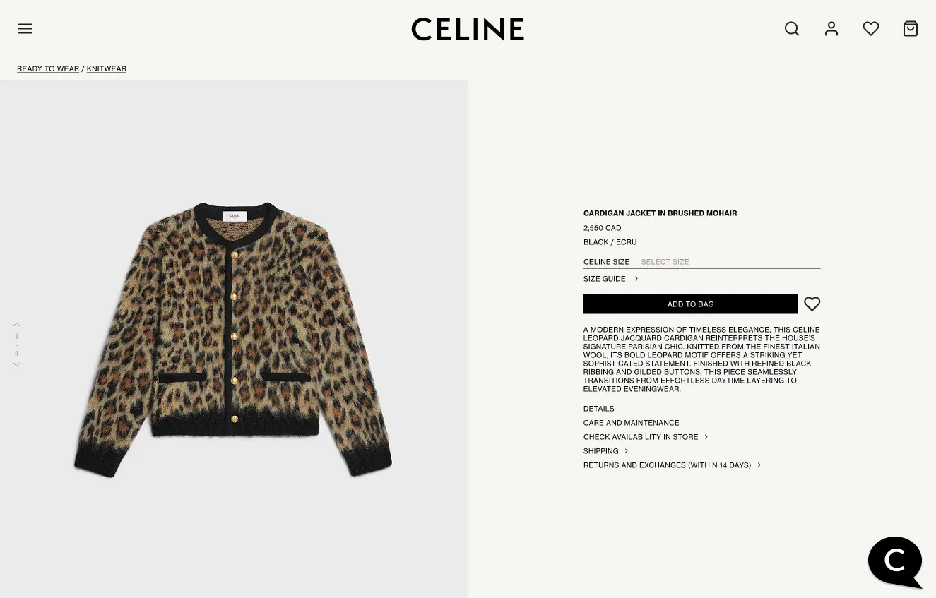
My redesigned Product Detail Page, with an updated gallery and product description.
A. Interactive Prototypes & Motion Enhancements
- Luxury-standard navigation - hamburger menu, progressive disclosure.
- Stronger product storytelling - hero images, curated sections.
- Intentional interactions & hover effects - smooth transitions, subtle animations
B. Expected Impact of the Redesign
- Improved Brand Perception - The shift from a functional catalogue to a boutique experience creates a more premium, high-end feel, aligning with competitors.
- More Engaging Navigation & Shopping Flow - The hamburger menu & progressive disclosure make navigation cleaner and more in line with luxury UX expectations.
- Better Storytelling & Product Presentation - The new homepage layout, hero images, and curated sections create a more immersive and exclusive shopping experience.
- Stronger Interaction & Motion Design - Micro-interactions and hover effects add depth and exclusivity, mimicking the subtle luxury cues used in high-end retail stores.
6. Conclusions & Reflections
A. Key Takeaways
- Luxury UX requires balancing minimalism & engagement
- Small details (menu wording, micro-interactions) elevate brand perception
- Motion enhances the shopping experience, guiding users seamlessly
B. Lessons Learned
- Competitive analysis is crucial for aligning UX with branding
- Iterative design allows for mid-process discoveries (e.g., chat feature)
- Luxury e-commerce benefits from a curated, immersive shopping flow.
C. Rapid Execution & UX Problem-Solving
Completing this case study in just three days reinforced my ability to rapidly assess UX challenges, design effective solutions, and document them efficiently. In fast-paced environments, execution speed is just as crucial as strong design thinking—balancing both ensures impactful, well-structured UX outcomes.