Case Study: Public Transit App Usability Improvement
Explore the Interactive Prototype
Problem Statement
Commuters relying on Google Maps face challenges when trying to stay informed about real-time transit updates. Critical information is often buried within the app’s interface, requiring users to switch views or dig through menus—an inconvenience during stressful travel scenarios. This case study explores how dynamic interface enhancements can simplify a complex system, reduce user friction, and support confidence during commutes.
Introduction
A. Overview
Public transit can be unpredictable—delays, changing routes, and last-minute updates often leave commuters frustrated. While Google Maps provides real-time updates, the information can be buried or overlooked by users navigating the app. This project aimed to simplify and enhance the commuting experience by introducing a dynamic transit overlay—a seamless addition to Google Maps that prioritizes critical, real-time information without disrupting the user’s core navigation flow.
B. Key Pain Points
- Delays and route changes are often displayed in less visible areas.
- Users have to switch between multiple views to access relevant transit updates.
- No dynamic mechanism currently highlights high-priority transit changes in real time.
C. Redesign Goal
To design an intuitive, accessible, and non-disruptive interface that presents real-time transit updates in a dynamic, easy-to-understand format.
D. Hypothesis
If we introduce a dynamic overlay that highlights critical transit information within the main navigation screen, users will be able to stay informed and adapt their routes without breaking their focus.
User Research
A. Methodology
To validate assumptions and identify key pain points, I conducted 3 semi-structured user interviews with regular transit users, each lasting between 30 minutes and 1 hour. The goal was to understand how commuters navigate public transit, especially in relation to mobile apps, and where their frustrations lie when dealing with real-time transit information.
In addition to gathering qualitative insights from interviews, I synthesized these findings into actionable personas that represent key user archetypes. These personas reflect the goals, pain points, and behaviors of different types of transit users, providing a reference point to guide design decisions throughout the project.
B. User Interviews
To gather meaningful insights and identify user pain points, I followed a structured yet flexible approach to conducting user interviews. My primary objective was to create a comfortable environment where participants could freely express their thoughts, habits, and frustrations related to public transit. By beginning with warm-up questions to establish context and rapport, I gradually transitioned into exploring specific challenges and behaviors. This progression allowed me to uncover deeper insights and identify patterns in their decision-making processes, app usage, and expectations for real-time transit information.
Below is the interview script I used, along with my thought process behind each section. I’ve highlighted key insight-generating questions in bold.
Warm-Up and Baseline Understanding
I begin with broad, non-intrusive questions designed to establish context and build a natural rapport with participants. These questions explore the user’s daily routines, preferred methods of transportation, and general experiences navigating public transit. This phase not only fosters trust but also helps me gather foundational insights about their decision-making, comfort level with transit apps, and overall perceptions of public transportation.
- What is your name?
- What is your occupation?
- Do you often go outside your neighborhood? Where? How Far?
How did you get here today?
- Why did you choose that method of transportation
Did you use an app to navigate?
- Why did you choose that app?
- What do you like about it?
Exploring Pain Points and Behavioral Patterns
Once the participant is more at ease, I gradually steer the conversation toward exploring their frustrations and challenges with public transit. I ask them to recall specific instances when things didn’t go as expected and probe for details about their emotional responses and coping strategies. This phase helps me identify recurring pain points and behavioral patterns that often go unnoticed in surface-level discussions.
How do you normally navigate public transportation?
- Before starting your journey
- During your journey
- Have you ever gotten lost while using public transportation?
- Have you ever regretted using public transportation? And why? Anything that could’ve helped alleviate your annoyance?
- Does weather play a role in your choice, particularly for public transportation? If yes, how?
- Have you ever blended your route between public transit and another mode? (i.e. ride sharing)
- Does distance play a role in your choice? If yes, how?
- How accessible is public transportation to you?
- Tell me about the last time you used public transportation.
- Tell me about a memorable time you used public transportation.
Probing App Usage and Feature Preferences
Building on the previous insights, I shift the focus to the participant’s experiences with public transit apps. I ask about the apps they currently use, the features they rely on most, and any limitations they’ve encountered. This section also encourages participants to articulate their expectations for real-time updates, app reliability, and overall usability—information that helps me understand gaps between their needs and existing solutions.
- Have you used any public transportation apps before? If yes, which one?
- How often do you use the public transit app?
- What feature do you use the most in the app, and why?
- How reliable is the public transit app in terms of providing accurate information, such as real-time updates or schedule changes?
- Can you recall a time when the app didn't meet your expectations? What happened?
- How would you rate the app’s overall ease of use on a scale of 1-10, and why did you choose that number?
Evaluating Emerging Technologies and Potential Solutions
As the conversation progresses, I introduce exploratory questions about emerging technologies, such as Apple’s Dynamic Island, and inquire about their openness to integrating these tools into their transit routines. This phase provides valuable insights into how users perceive novel solutions and helps validate concepts that could enhance their transit experience through dynamic, context-aware notifications.
- Do you use a phone (or tablet, laptop) while taking public transit? If so, for what?
Do you had headphones on while using the public transit? If so, how well can you hear what’s going on around you?
- Do you want to hear anything?
- What kind of updates would you want to receive while using public transportation?
How would you like to receive said updates (audio, vibration, pop-up, etc.)?
- How do you typically receive updates now?
Do you use, wearable technology? If so, which products?
- What feature(s) do you use the most?
- Do you use it for navigation? If so, how? Which app(s)?
- Do you use the public transit app on it? If so, describe your experience.
Transitioning to Solution-Focused Discussions
By the time we reach this phase, participants are fully engaged and more willing to provide thoughtful feedback. I focus on validating potential solutions by presenting concepts that address the identified pain points. I encourage users to imagine how these improvements would impact their overall transit experience, allowing me to refine design directions and ensure alignment with user needs.
Do you use the dynamic island feature on iPhone?
- If not, could you see yourself using this feature in general? How?
- What kind of information/notifications do you use it for?
- What kind of public transportation related notifications/information can you see it being used for?
- Do you have anything else you want to share?
Scroll to view all interview questions
C. Key Insights from User Interviews
After conducting the interviews, I analyzed the responses to identify recurring themes and patterns. These insights helped surface common pain points, user preferences, and contextual factors that influence transit decisions. Understanding these pain points laid the foundation for exploring targeted solutions that address the needs of public transit users.
- All users use Google Maps to set their routes
- Most users do not use a separate, public transit-focused application
- Users want to avoid walking through inclement weather during their trips
- Users enjoy when using public transit is stress-free and they can sit and relax
- Users find it difficult to hear and understand announcements, especially while wearing headphones
- My interviewed users did not use wearable technology
- My interviewed users did not have iPhones that have dynamic island functionality, but could see how it could bea beneficial solution to some of the problems they are facing
D. Personas
To further distill my findings, I created personas that represent the core behaviors, goals, and frustrations of distinct transit user groups. These personas capture a range of perspectives—from frequent app users who prioritize speed and efficiency to occasional riders who need more guidance and reassurance. By grounding design decisions in these personas, I ensured that the proposed solutions aligned with the diverse needs of public transit users.
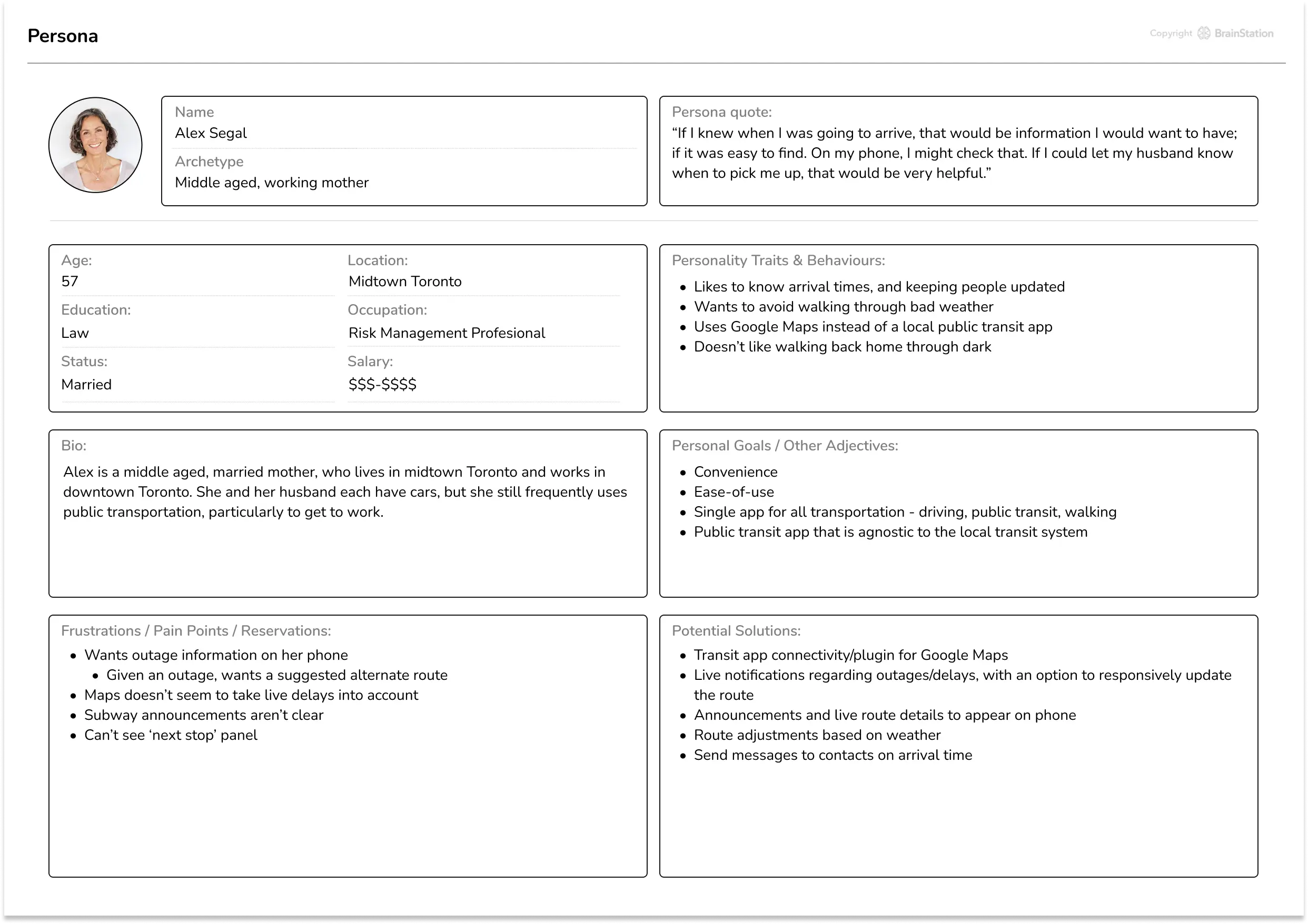
Alex Segal Persona
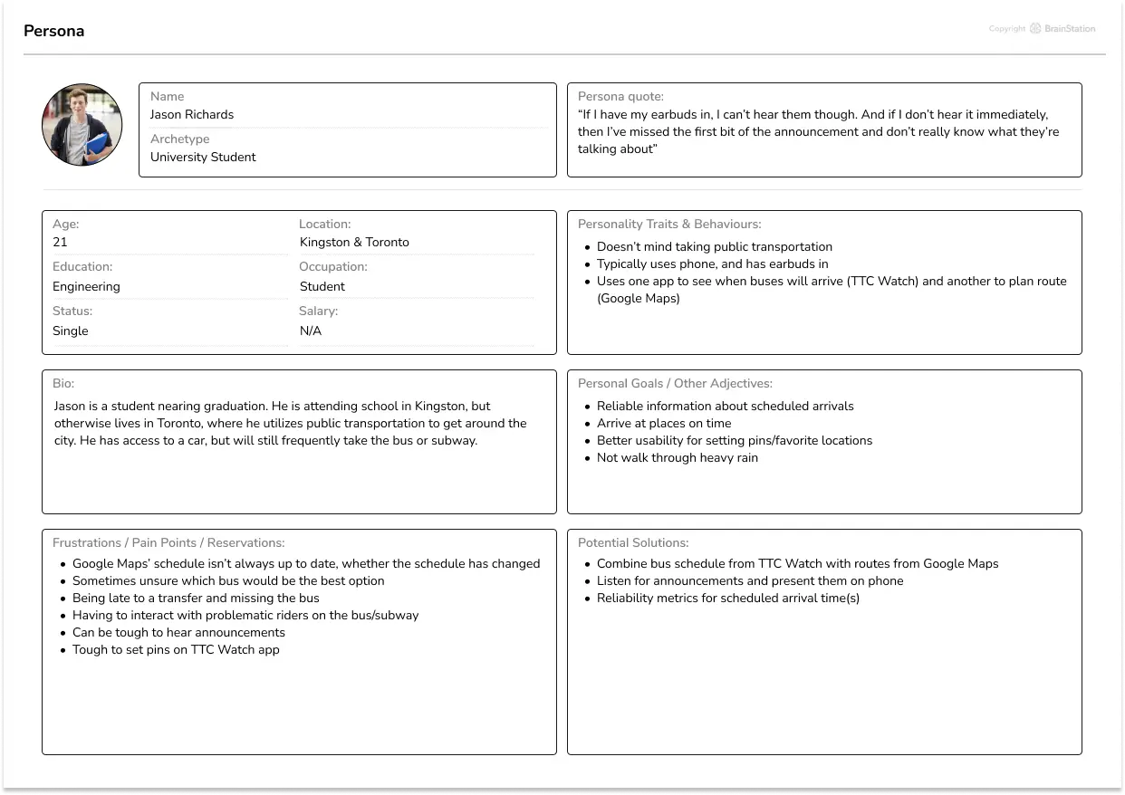
Jason Richards Persona
Design Process & Exploration
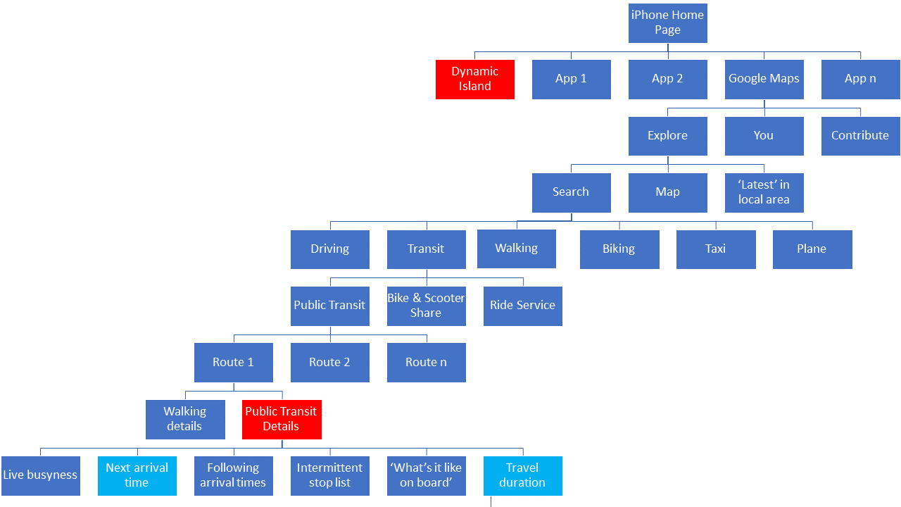
A. Information Architecture
A strong information architecture (IA) is the backbone of any intuitive app experience. My assumption that users use Google Maps to set their routes was validated during user interviews, so I began by reviewing Google Maps' existing structure. Along with gathering feedback from user interviews, I identified areas where the IA could be simplified and made more logical. The primary goal was to surface frequently accessed features while reducing friction in core user tasks.
The old Google Maps information architecture
The original architecture for public transit features in Google Maps placed core functionality deep within multiple layers of navigation, making it harder for users to quickly access critical information. Public transit details were grouped with unrelated transportation modes, and real-time updates such as delays, live arrival times, and stop notifications were buried in submenus.
Key Issues in the Old Structure:
- Deep Nesting: Transit options were grouped with other modes like biking, walking, and ride-sharing, making access cumbersome.
- Lack of Prioritization: Live updates and essential information were buried within layers of irrelevant content.
- Disjointed Access to Transit Details: Important features like arrival times and notifications were not contextually surfaced during a user’s journey.
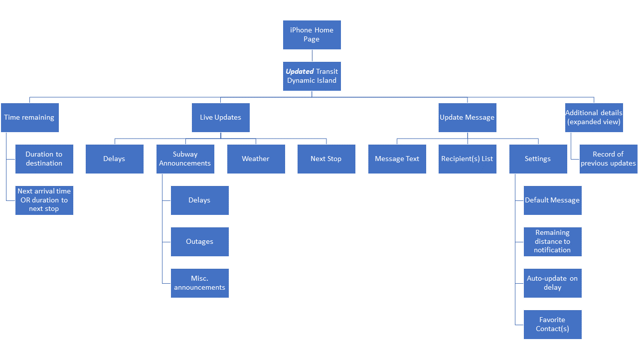
My New Google Maps Information Architecture, featuring my updated transit dynamic island
In the refined architecture, I prioritized public transit features by elevating them to the top level of the navigation hierarchy. Core features such as arrival times, delays, and contextual updates are now surfaced immediately, reducing cognitive load and making the interface more intuitive. This updated structure integrates seamlessly with iPhone's Dynamic Island feature to provide glanceable, real-time updates during transit.
Key Improvements in the New Structure:
- Prioritizing Public Transit: Transit details and live updates now sit prominently at the top level, minimizing the number of taps needed to access essential information.
- Grouping by Context: Related features, such as route details, announcements, and delays, are logically grouped to align with the user’s journey.
- Seamless Real-Time Updates: Notifications and dynamic updates are surfaced contextually, keeping users informed without requiring additional interactions.
B. Task Flows: Mapping Out Key Journeys
Once the information architecture was restructured, I developed task flows to map out key user journeys. These flows helped visualize how users would complete core actions and identify potential friction points.
Task One
- User Story: A User who wants more detailed information about their trip on public transit.
- Task: Displaying live information and updates by connecting to third-party public transit apps.
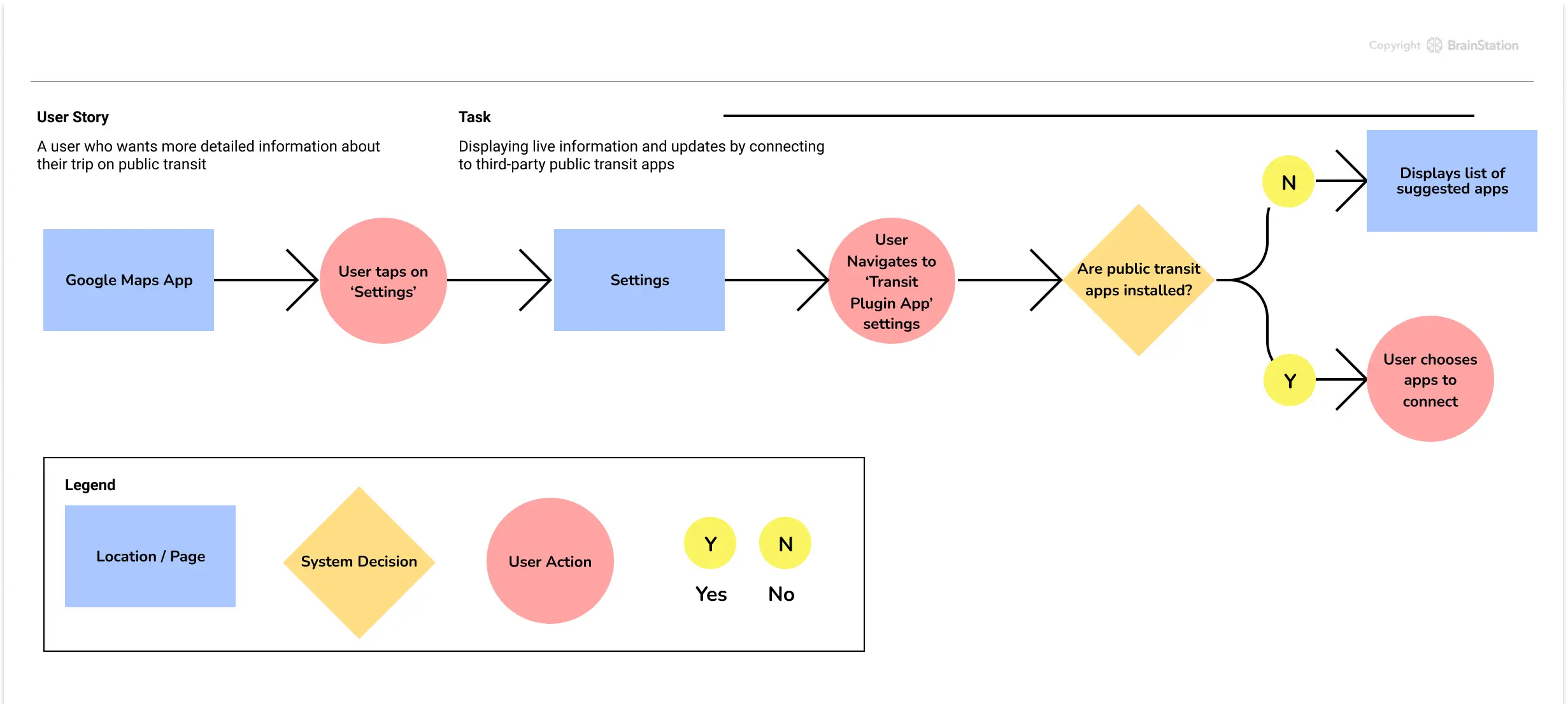
Task flow template courtesy of BrainStation, 2024.
Task Two
- User Story: A wife whose husband picks her up from the subway after work.
- Task: Conveniently update husband on arrival time.
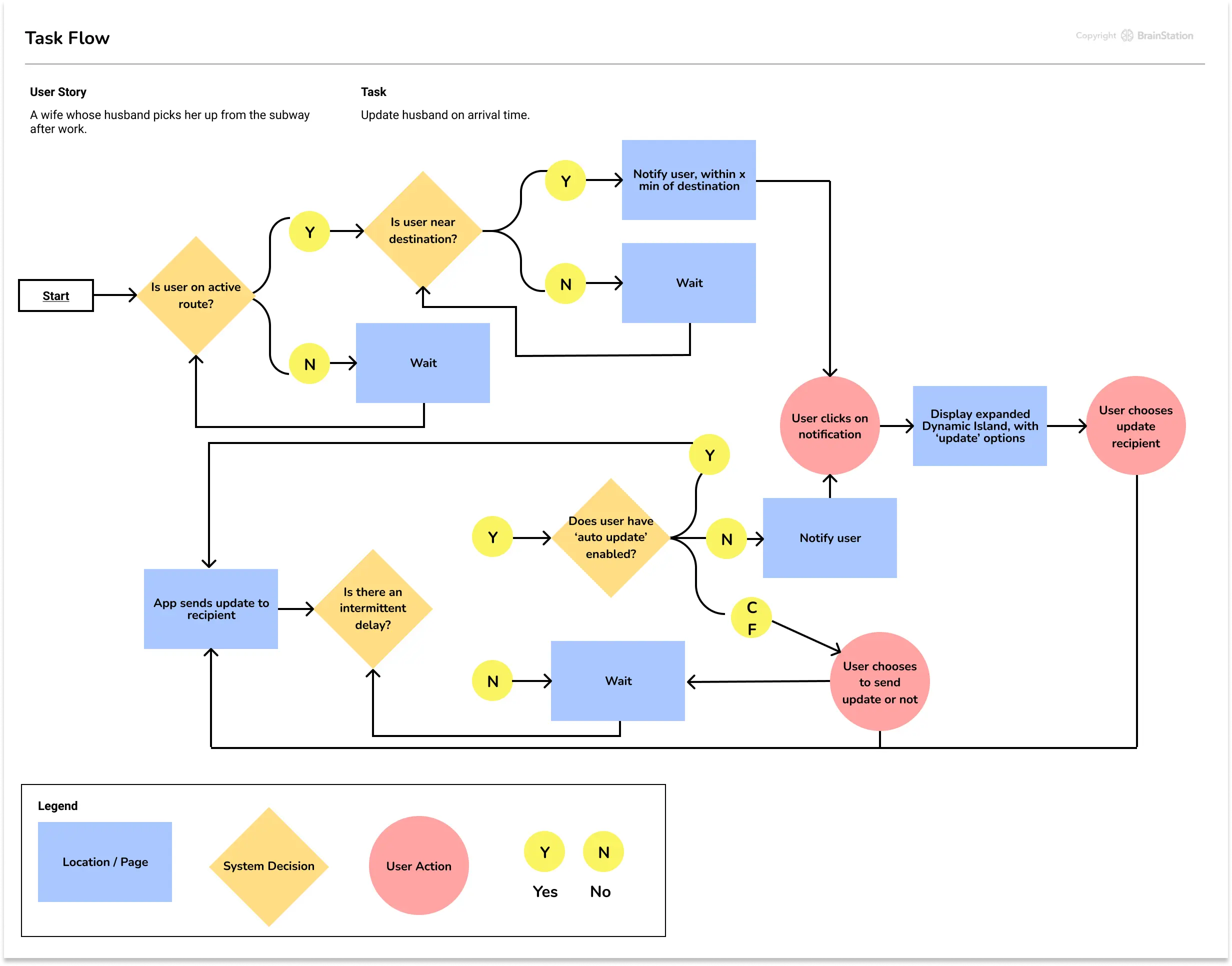
Task flow template courtesy of BrainStation, 2024.
C. Initial Sketches: Exploring Concept Variations
Before moving into digital wireframes, I explored a range of potential designs through quick sketches to visualize how key features would interact within the Dynamic Island environment. These initial sketches allowed me to think through various interaction patterns, ensuring that transit updates and messaging features remained accessible and non-intrusive.
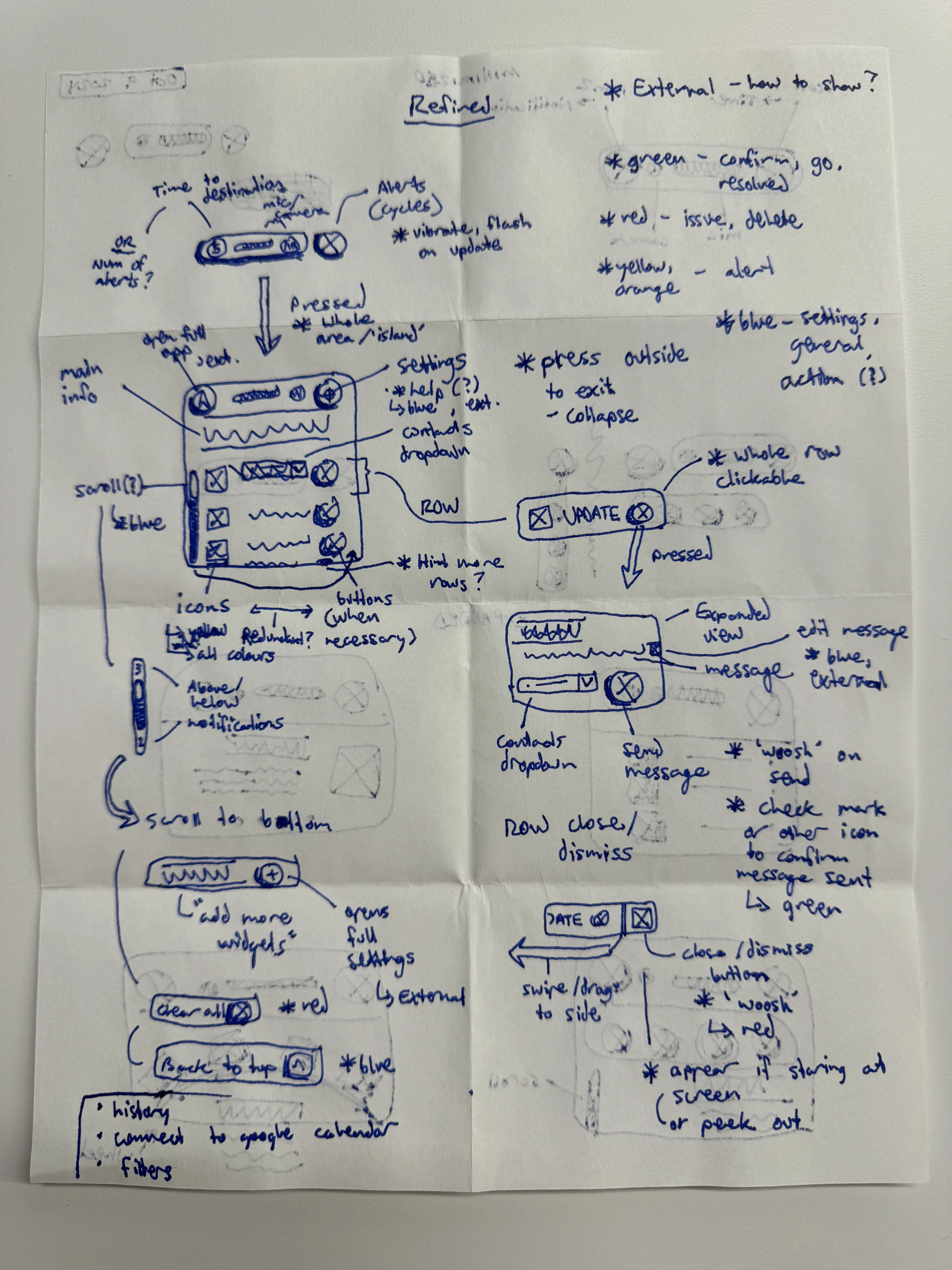
Sketches based on Task Two
Key Sketches & Concept Exploration
Expanded View & Core Information
This sketch focuses on how the expanded view of the Dynamic Island would display essential information such as estimated time to destination, cycle alerts, and relevant notifications.
- I explored a layout that displays updates dynamically while keeping the interface minimal, allowing users to absorb critical information at a glance.
Main Settings & Interaction Patterns
To account for user interaction, I sketched a variety of dropdown and scrollable row options that would allow users to access additional controls and refine their preferences.
- These designs aimed to strike a balance between providing customization options and maintaining an intuitive, streamlined interface.
“Update Message” Feature
One of the critical sketches explored the Update Message feature, enabling users to quickly send predefined or custom messages while in transit.
- I visualized a seamless flow where users could update contacts on their estimated time of arrival, ensuring clarity and reducing uncertainty during commutes.
Insights Gained From Skecthing
- Clarified Interaction Models: Sketching out multiple approaches allowed me to refine the interaction model, ensuring a balance between simplicity and flexibility.
- Anticipating Edge Cases: Early exploration helped me identify potential pain points, such as dismissing or editing messages and handling multiple alerts.
- User-Centered Prioritization: By iterating on these initial concepts, I was able to prioritize high-impact features while maintaining an elegant, lightweight interface.
These sketches laid the foundation for my wireframes, enabling me to transition smoothly into more refined design iterations.
E. Exploring Dynamic Island’s Potential for Transit
During my research, I explored emerging technologies that could enhance the transit experience. Apple’s Dynamic Island, introduced with the iPhone 14 Pro, stood out as a promising feature for delivering real-time, context-aware notifications. Its ability to adapt visually and dynamically to different tasks makes it a natural fit for transit-related updates.
What is Dynamic Island?
Dynamic Island transforms the iPhone’s notch into an interactive, adaptive UI element that provides glanceable information and live updates. It intelligently expands, contracts, and animates based on the app in use—offering a more immersive and intuitive experience.
For transit, Dynamic Island could serve as a passive yet highly accessible way to:
- Display real-time arrival updates and route changes.
- Provide contextual alerts, such as delays or service interruptions.
- Blend navigation updates seamlessly into the user’s flow without interrupting other tasks.


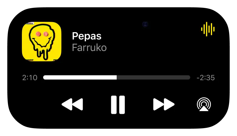
Examples of iPhone's Dynamic Island feature
Why Dynamic Island Makes Sense for Transit Users
Through my interviews and observations, I found that users often engage with their phones while using transit, checking for updates and adjusting their routes when necessary. Dynamic Island presents an opportunity to reduce cognitive load and improve the flow of information—providing relevant updates without requiring constant interaction or screen switching.
Wireframes & Prototyping
A. Wireframes: Bringing Structure to Concepts
The wireframing phase was crucial for defining the visual hierarchy and user interactions. I created mid-fidelity wireframes that mapped out the structure of key screens while maintaining a focus on:
- Prioritizing Real-Time Updates: Ensuring that essential information remains visible and accessible.
- Highlighting Contextual Alerts: Displaying safety and accessibility alerts at relevant moments.
- Simplifying Core User Tasks: Minimizing complexity while ensuring smooth task completion.
The wireframes allowed me to test layout variations and gather early feedback before committing to high-fidelity designs.
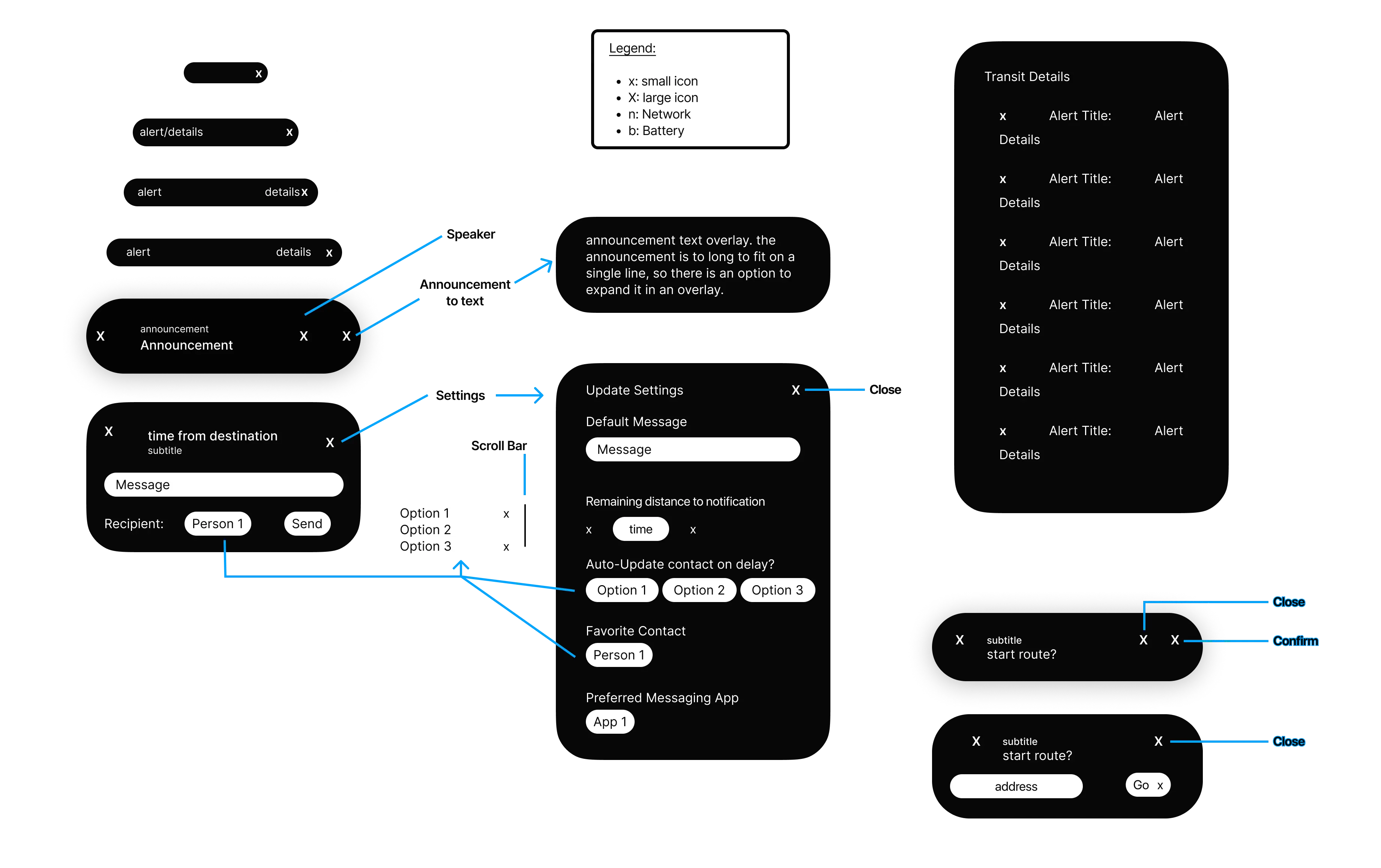
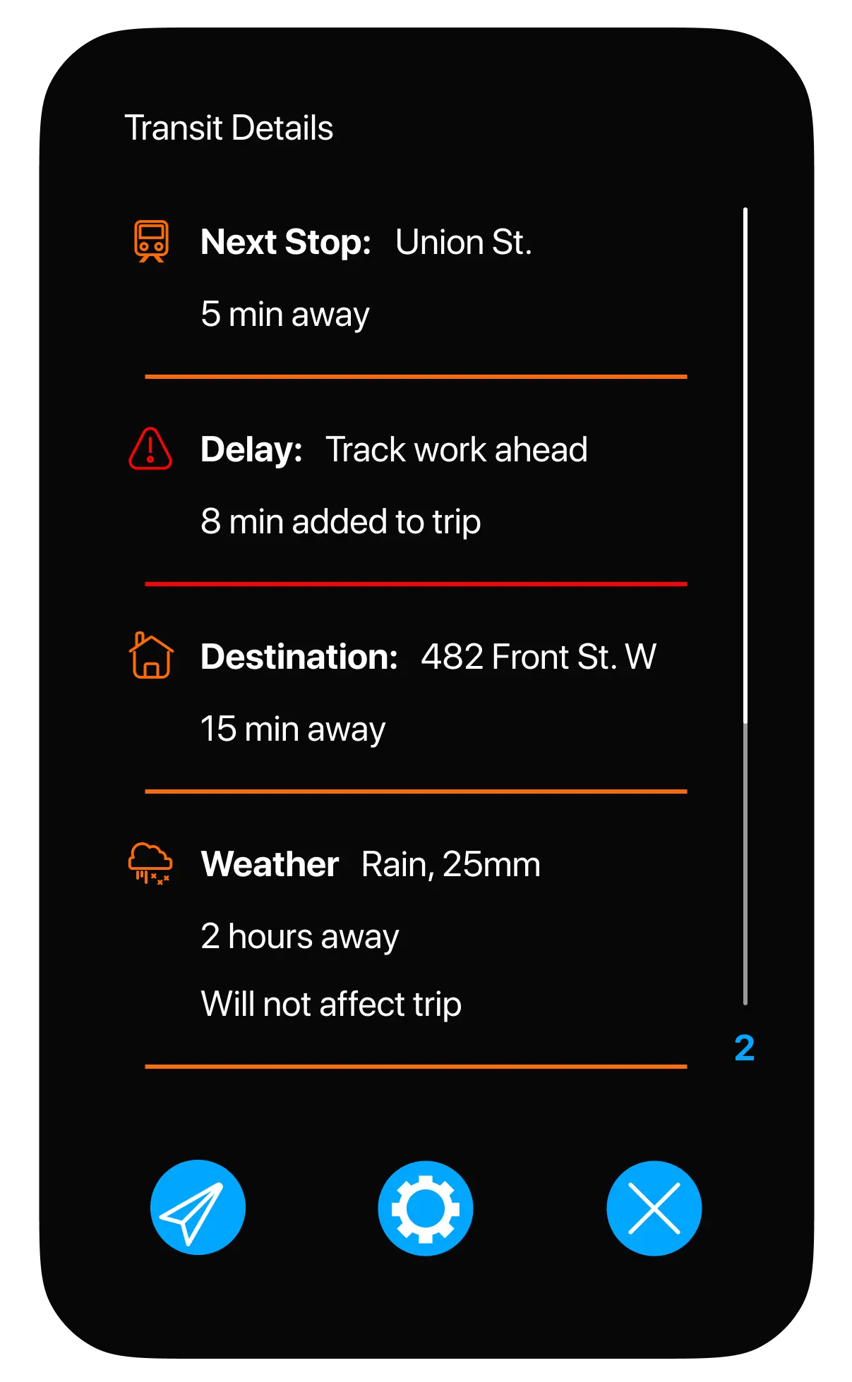
Wireframes
B. High-Fidelity Prototype: Refining for Usability
Building upon the wireframes, I created a high-fidelity prototype to bring the envisioned experience to life. The interactive prototype demonstrated:
- Dynamic Notifications: Leveraging the Dynamic Island to deliver real-time updates and contextual alerts.
- Simplifying Core User Tasks: Minimizing complexity while ensuring smooth task completion.
- Seamless Mode Transitions: Smoothing transitions between public transit, ride-sharing, and other transportation modes.
Explore the Interactive Prototype
Visual Identity & Design System
A. Style Guide: Defining a Visual Language
To maintain consistency and clarity across the redesigned interface, I developed a style guide that formalizes the app’s visual identity. The guide provides specifications for:
- Typography: A clean, legible type system optimized for mobile.
- Color Palette: High-contrast, accessible colors that reinforce hierarchy.
- Component Library: Modular, reusable components with clearly defined states.
The style guide ensures that future updates remain visually consistent and aligned with both the platform's and the app’s core identities. (iPhone and Google Maps, respectively)
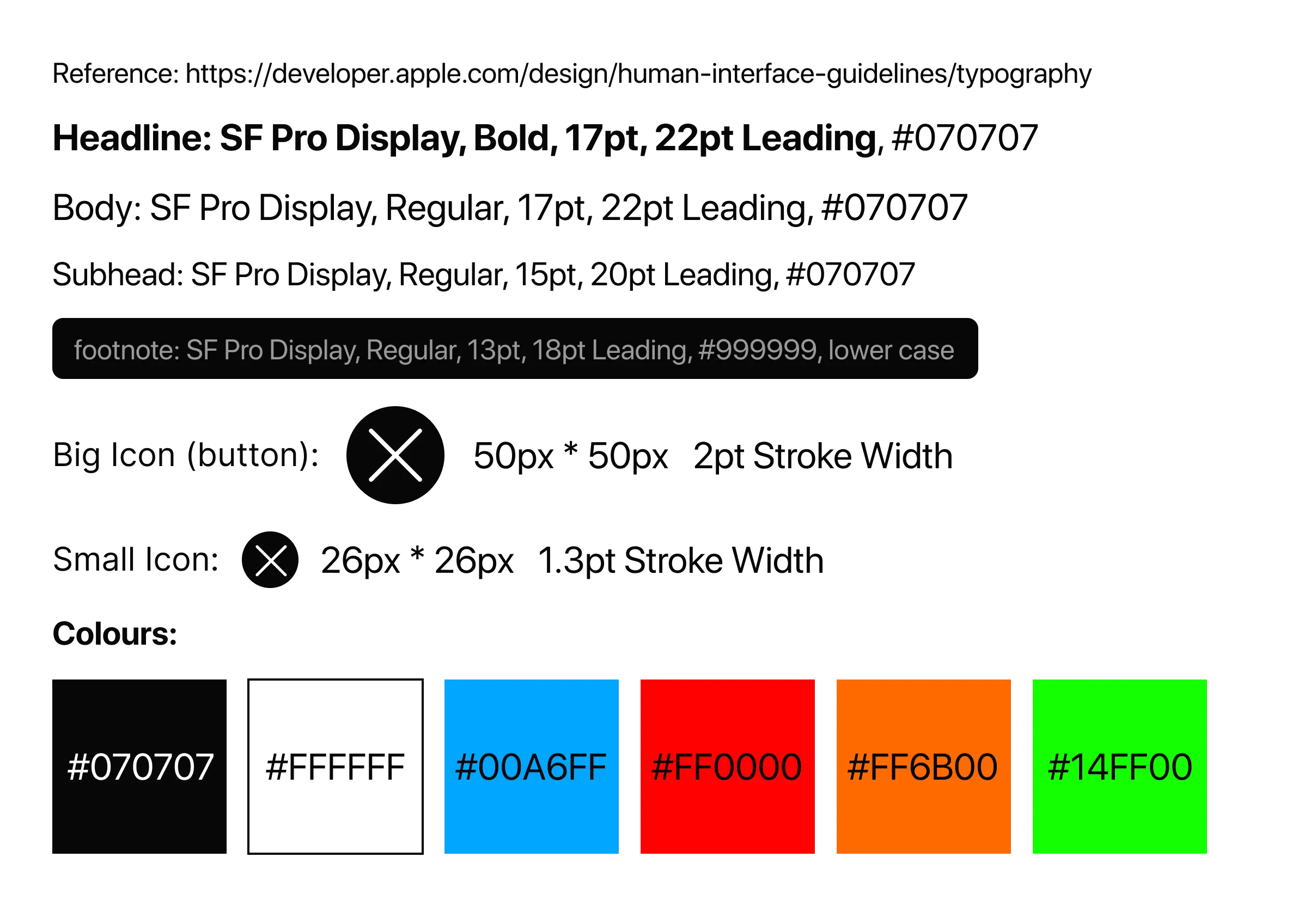
The style guide for the new feature's components
B. Iconography: Enhancing Clarity Through Visual Cues
Icons play a critical role in reinforcing key actions and guiding users through complex workflows. I designed a custom icon set that aligns with the platform's and app’s visual language, focusing on:
- Clarity & Simplicity: Ensuring intuitive recognition of key actions.
- Consistency Across Interfaces: Using a unified design language.
- Scalability for Future Updates: Allowing for seamless expansion as the app evolves.
Icons
Key Learnings & Reflections
A. Designing with Real-World Insights
Through the process of designing and refining this project, I gained valuable insights into balancing simplicity, leveraging emerging technologies, and iterating based on user feedback.
Balancing Simplicity with Context
One of the biggest challenges was finding the right balance between surfacing real-time information and avoiding cognitive overload. Prioritizing key updates while maintaining interface simplicity was essential for improving the user experience. Through this process, I learned how sketching and wireframing early on can streamline later stages of development, ensuring that information is presented in a way that supports, rather than overwhelms, the user.
Designing for Dynamic Interactions
Incorporating Dynamic Island features presented an exciting opportunity to enhance context-aware notifications. This experience taught me how to leverage emerging technologies to deliver meaningful interactions that adapt to user context. I also discovered how small design decisions can have a significant impact on user perceptions, uncovering nuanced insights through interviews and usability testing.
Iterating with User Feedback
Frequent usability testing and feedback loops played a critical role in refining the design. Iterating based on real-world insights allowed me to continuously improve the interface and ensure that the final solution aligned with user expectations. I realized that some of the problems I encounter as a frequent transit user aren’t necessarily shared by others, emphasizing the importance of diverse perspectives in identifying pain points and opportunities.
B. Opportunities for Future Growth
While the current iteration meets the initial project goals, I’ve identified several areas where the concept could be expanded or refined to further enhance the user experience.
- Wearable Device Integration: Exploring ways to deliver key updates through wearable devices, enhancing convenience and real-time awareness.
- AI-Powered Route Prediction: Leveraging machine learning to predict commonly taken routes and proactively suggest optimal paths.
- Real-Time Rider Feedback: Encouraging users to submit real-time status updates, improving data accuracy and transit efficiency.
- Refining Visual Modes: Offering alternative visual modes to accommodate different user preferences and accessibility needs.
- Standalone App Possibility: Considering whether this solution could evolve into a standalone app that integrates Google Maps as a backend plugin.
By addressing these areas in future iterations, this project could further enhance public transit experiences and deliver greater value to diverse user groups.